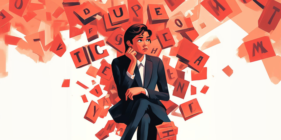
The best fonts for presentations: The complete guide
Over 30 million PowerPoint presentations are created every day – but many fall short of their potential due to an often overlooked detail: font choice. A recent study by the Readability Consortium at the University of Central Florida reveals a surprising finding: The right font can increase reading speed by up to 35%, while the wrong choice undermines your credibility before you’ve even spoken a word.
Marion Koppitz, CEO of i-pointing and former senior consultant at Siemens Management Consulting, sums it up: “The font is your presentation’s calling card. The wrong choice costs you credibility before you’ve even spoken a word.”
In this comprehensive guide, you’ll learn:
- The 5 best fonts for professional presentations (scientifically validated)
- How to strategically combine fonts for maximum impact
- The optimal font sizes according to room size and viewing distance
- The best color combinations for maximum readability
Fun fact from research: Studies show that people are more likely to believe information in easily readable fonts than in difficult-to-read ones—a phenomenon called “cognitive fluency.” So your choice of font not only influences whether your audience can read your slides, but also whether they believe you.
The psychology behind fonts: What research says
Fonts are more than just design elements—they are psychological triggers that subconsciously influence how your audience processes and evaluates your message. A meta-analysis of over 50 studies on typography perception shows that the choice of font influences perceived credibility by up to 35%, depending on the context and target audience.
The three psychological dimensions of fonts
1. Trustworthiness
Serif fonts such as Times New Roman or Garamond activate associations with tradition, education, and seriousness. Research in the financial sector shows that presentations with serif fonts are perceived as 15% more trustworthy than identical content in Comic Sans. The reason? Centuries of use in books, newspapers, and official documents have created a strong cultural imprint.
When to use: Financial presentations, legal documentation, academic lectures, traditional industries
2. Modernity and innovation
Sans serif fonts such as Arial, Helvetica Neue, or Calibri convey clarity, efficiency, and a forward-looking approach. A study by Monotype involving 4,800 creative professionals confirms that 83% see typography as a key element of brand personality. In the technology sector, sans serif fonts increase perceived innovation by 22%.
When to use it: Tech pitches, start-up presentations, modern corporate communications, design showcases
3. Readability and cognitive fluency
The often overlooked factor: How easily your brain can process text influences how much you trust the message. Psychologists call this “processing fluency”—the easier it is to read, the more credible the content appears.
Dr. Ben D. Sawyer, director of the Readability Consortium at the University of Central Florida, explains: “Our research shows that personal font preference does not always correspond to optimal readability. What people believe they read quickly is often not what they actually read fastest.”
What this means for your presentation: Choose fonts with high readability (large x-height, clear letter shapes, sufficient spacing) – even if you personally find another font “cooler.” The more readable font is perceived as more credible, even if the content is identical.
Fonts for different presentation contexts
| Context | Recommended font | Psychological effect | Research basis |
|---|---|---|---|
| Finance/banking | Garamond, Georgia | +15% trustworthiness | Design Psychology Research (2023) |
| Technology/innovation | Helvetica Neue, Calibri | +22% innovation perception | Monotype Survey (2024) |
| Healthcare | Verdana, Arial | Maximum clarity | WCAG Accessibility Guidelines |
| Creative Industry | Montserrat, Proxima Nova | +18% Creativity Perception | Brand Perception Studies |
| Academic | Garamond, Palatino | +20% Competence Assessment | Educational Research |
The practical takeaway: There is no such thing as the “best” font—only the best font for your specific context. Ask yourself:
- What emotion do I want to convey? (Trust vs. innovation vs. accessibility)
- What does my audience expect in this setting? (Tradition vs. modernity)
- How far away is my target audience sitting? (Legibility from a distance)
The top 5 fonts: Scientifically validated and proven in practice
These five fonts have proven themselves in years of professional practice and are confirmed by current readability research. Each font has specific strengths—the right choice depends on your context.
1. Helvetica Neue: The gold standard for professionalism
Why Helvetica works:
As the most neutral font in a professional context, Helvetica is considered “invisible”—it does not distract from the content. Originally developed in Switzerland in 1957, it has a mathematical precision in its proportions that guarantees universal readability.
Technical specifications:
- Category: Sans serif (Neo-Grotesque Sans-Serif)
- Availability: Pre-installed on Mac, Windows requires license (~$50) or free alternative: Arial
- X-height: Large (56% of capital height) → excellent legibility from a distance
- Character set: Comprehensive special character set, 8 font weights available
- Optimal sizes: Headings 36-44pt, body text 28-32pt
Best practices:
- ✅ Best for: Company presentations, tech pitches, conference presentations, international audiences
- ✅ Strengths: Neutral aesthetics, non-distracting, internationally recognized, excellent in all sizes
- ⚠️ Caution: Can appear sterile when used without color accents or visual breaks
- ⚠️ Not available on: Windows standard installations (license required)
Pro tip from practice: If Helvetica is not available, use Arial as an almost identical substitute. For 99% of presentations, the difference is negligible—only typography purists will notice it.
Using font families wisely:
Helvetica Neue has eight weights (Thin to Black). Use Helvetica Neue Light for subheadings, Helvetica Neue Medium for body text, and Helvetica Neue Bold for headlines—this allows you to create hierarchy within a font family without needing a second font.
2. Verdana: The readability champion
The research behind Verdana:
Developed specifically for Microsoft in 1996 with one goal in mind: perfect screen readability. The study by Hojjati & Muniandy (2014) shows that Verdana delivers 23% faster text comprehension on screens than Times New Roman with identical content. The reason for this is the extremely generous spacing between letters.
Technical specifications:
- Category: Humanistic sans serif (specially optimized for screens)
- Availability: Pre-installed on Windows & Mac ✅ (perfect for compatibility)
- X-height: Very large (61% of capital height) → best readability of all standard fonts
- Special feature: Extra-wide letters with generous spacing between characters
- Optimal sizes: Headings 32-40pt, body text 24-28pt (can be smaller than other fonts with the same readability)
Best practices:
- ✅ Ideal for: Large conference rooms, older audiences (50+), presentations with lots of text, livestream presentations with compression
- ✅ Strengths: Unsurpassed screen readability, crystal clear even at low projector resolutions (1024×768)
- ⚠️ Caution: Wide character set = requires more space, can lead to line breaks in long titles
- ⚠️ Design note: Appears less “elegant” than Helvetica, more functional – less suitable for design-heavy presentations
Scientific background:
Verdana was developed with ClearType technology in mind. The extremely open counters (the interior spaces of letters such as “e” or ‘a’) prevent details from “blending together” at low resolutions – a common problem with other fonts on projectors.
Practical application:
Medical conferences use Verdana more often than average. The reason? Many technical terms with small details (subscripts, special characters) remain legible even from the back row of a 500-person auditorium.
3. Calibri: The modern standard
Microsoft’s strategic decision:
In 2013, Calibri replaced Arial as the standard font in Microsoft Office—not a random choice. Calibri was developed with the aim of combining the “warmth” of a humanistic font
(curves, organic shapes) with the clarity of a sans-serif font.
Technical specifications:
- Category: Humanistic sans-serif (friendlier than geometric sans-serif)
- Availability: All Microsoft Office versions from 2007 onwards ✅ (over 1 billion users have it pre-installed)
- X-height: Large (58% of capital height)
- Special feature: Slightly rounded corners create a “warmer” impression than Arial/Helvetica
- Optimal sizes: Headings 34-42pt, body text 26-30pt
Best practices:
- ✅ Best for: Business presentations, HR/people topics, education, informal to semi-formal settings
- ✅ Strengths: Professional but accessible, “friendlier” than Helvetica, extremely high compatibility
- ⚠️ Caution: So widespread that it is perceived as the “standard office look” – may be too generic for brand presentations
- ⚠️ Not suitable for: Ultra-formal settings (legal, financial consulting) where more traditional fonts are expected
The design advantage:
Calibri’s slightly rounded terminals (end points of the strokes) reduce visual “stress” compared to more angular fonts. Neuroscience studies show that rounded shapes activate the reward center in the brain slightly more than angular shapes – Calibri makes subtle use of this effect.
Pro tip: Calibri offers excellent support for different number styles. For financial slides, activate “Tabular Figures” in PowerPoint under Format → Text Effects → Number Spacing – this will align numbers perfectly in columns.
4. Garamond: Elegance for sophisticated content
The Renaissance font for modern presentations:
Originally created in the 16th century by Claude Garamond, this serif font is the epitome of timeless elegance. When Helvetica “disappears,” Garamond “shines”—it draws attention to itself, but in a sophisticated way.
Technical specifications:
- Category: Old-style serif (low stroke weight contrast, organic shapes)
- Availability: Windows & Mac have variants pre-installed (Adobe Garamond in Creative Cloud)
- X-height: Small (50% of capital height) – Note: Requires larger point sizes than sans-serif fonts!
- Special feature: Elegant proportions, lower “visual mass” = appears lighter on the slide
- Optimal sizes: Headings 38-48pt, body text 30-34pt (4-6pt larger than Arial with the same readability)
Best practices:
- ✅ Ideal for: Academic lectures, cultural events, luxury brands, editorial design, book presentations
- ✅ Strengths: Creates an intellectual, sophisticated impression; saves space with large amounts of text
- ⚠️ Critical error: Details are lost on projectors in sizes smaller than 28pt → becomes illegible!
- ⚠️ Not suitable for: Tech presentations (looks old-fashioned), very large rooms (serifs blur from a distance)
The serif challenge:
Christoph Koeberlin, professional type designer at FSI Fontshop International, warns: “Serif fonts that work excellently on paper lose their legibility on projectors with a resolution of 1024×768. The fine serifs blur into indistinct spots.”
Solution: Only use Garamond if:
- Projector resolution ≥ 1920×1080 (Full HD or better)
- Room size < 50 people (viewing distance max. 15 meters)
- Font size ≥ 30pt for body text
Recommended combination: Garamond (headings) + Helvetica Neue Light (body) = classic meets modern. This combination is particularly suitable for presentations that aim to combine tradition and innovation.
5. Arial: The reliable all-rounder
Why Arial works despite criticism:
Typography purists often turn up their noses at Arial—too simple, too ubiquitous, a “cheap Helvetica copy.” But from a pragmatic point of view, Arial is the safest choice for universal compatibility: over 2 billion devices worldwide have Arial preinstalled.
Technical specifications:
- Category: Sans serif font (similar to Helvetica, but with wider proportions)
- Availability: Pre-installed on Windows ✅, pre-installed on Mac ✅, Linux systems ✅
- X-height: Large (57% of capital height)
- Special feature: Developed in 1982 specifically for screen display, identical metrics to Helvetica
- Optimal sizes: Headings 36-44pt, body text 28-32pt
Best practices:
- ✅ Best for: When compatibility is more important than design, international conferences (different systems), last-minute presentations
- ✅ Strengths: Universally available, solid readability, neutral, works in 99% of all scenarios
- ⚠️ Design weakness: Considered “design laziness” in creative industries—shows a lack of attention to detail
- ⚠️ Typographic compromise: “R” and “a” have less elegant proportions than Helvetica
Compatibility insurance:
You create a presentation using a custom font, but forget to embed it—the font is missing on the conference laptop and everything is substituted with Arial. Pro tip: Design the layout in Arial from the outset. If substitution occurs, at least the layout will remain intact.
Arial vs. Helvetica – The practical difference:
For 95% of target audiences, the difference is invisible. Relevant scenarios for genuine Helvetica:
- Luxury brands (Helvetica’s “pedigree” is part of the brand)
- Design agencies (where typography knowledge is expected)
- Swiss companies (Helvetica = national typography icon)
For everyone else, Arial serves the purpose perfectly.
Quick Reference: The Top 5 at a Glance
| Situation | Best Choice | Why |
|---|---|---|
| Business presentation | Helvetica Neue / Calibri | Professional, universally accepted |
| Large rooms (100+ people) | Verdana | Best legibility from a distance |
| Formal / Academic | Garamond (HD only) | Cultured, traditional |
| Last minute / Compatibility | Arial | Available everywhere |
| Tech / Start-up | Helvetica Neue | Modern, innovative |
Mix and match: How to combine fonts cleverly
Now that you know the superstars, it’s time to get excited about the art of font combination! The right pairing can elevate your presentation from “solid” to “impressive.” But be careful—here, less is more.
The scientific basis for successful pairings
Typographers use three principles for harmonious font combinations:
1. Contrast
Combine different font characters: serif + sans serif, thick + thin, large + small. Contrast creates visual hierarchy and guides the eye. Example: Garamond (elegant, serif) for headings + Helvetica Neue (clear, sans-serif) for text.
2. Harmony
The fonts should share similar proportions or historical roots. Avoid extreme stylistic clashes (e.g., not futuristic + Victorian). Example: Calibri + Verdana – both humanistic sans-serifs with similar “temperatures.”
3. Hierarchy
Use sizes, weights, and styles to create clear levels of information. Your eye should immediately know: “This is the main heading, this is body text, these are details.”
The golden rule: Maximum 2 font families
No more than two fonts per presentation. More than that leads to visual overload. Exception: A third font for logos/branding is acceptable, but does not count as content typography.
Professional alternative: Use only ONE font family with different weights. Helvetica Neue, for example, has 8 weights (Thin, Light, Regular, Medium, Bold, Heavy, Black) – this allows you to create hierarchy without needing a second font.
7 proven font combinations for presentations
1. The business classic
Arial Bold (headings) + Calibri Regular (text)
Why: Universally available, professional, solid readability
🎯 Best for: Company quarterly presentations, status updates
2. Modern minimalism
Helvetica Neue Bold (headings) + Helvetica Neue Light (text)
Why: Elegant consistency within a family, timeless
🎯 Best for: Design pitches, start-up presentations, tech conferences
3. The elegant contrast
Garamond Bold (headings) + Helvetica Neue Regular (text)
Why: Classic meets modern, visually interesting, sophisticated
🎯 Best for: Academic lectures, cultural events, editorial
4. The readability machine
Verdana Bold (headings) + Arial Regular (text)
Why: Maximum readability from a distance, even with poor projectors
🎯 Best for: Large conference rooms (100+ people), webinars
5. The warm all-rounder
Calibri Bold (headings) + Calibri Regular (text)
Why: Friendly, accessible, extremely high compatibility
🎯 Best for: HR presentations, education, internal meetings
6. The premium look
Garamond (headings) + Garamond Regular (text, larger pt)
Why: Consistent elegance, saves on fonts
🎯 Best for: Luxury brands, law firms, museum lectures
⚠️ Caution: Only for HD projectors (≥1920×1080) and font sizes ≥30pt!
7. The safe haven
Arial Bold (headings) + Arial Regular (text)
Why: Works everywhere, always, on any system
🎯 Best for: Last-minute presentations, unfamiliar tech environments
Common pairing mistakes (and how to avoid them)
❌ Combining fonts that are too similar
Example: Arial + Helvetica look almost identical → confusing instead of structured
✅ Solution: If both are sans-serif, then use fonts with distinctly different characters (e.g., geometric + humanistic)
❌ Too many styles within a presentation
Example: Normal, italic, bold, bold italic, underlined → visual chaos
✅ Solution: Maximum 3 styles – normal (text), bold (headings), italic (quotes/emphasis) if necessary
❌ Too small differences in size
Example: Heading 28pt, text 26pt → hierarchy not recognizable
✅ Solution: At least 8pt difference between heading and text
❌ Decorative fonts for long texts
Example: Brush script for entire paragraphs → illegible and tiring
✅ Solution: Decorative fonts only for short headlines (<5 words), never for body text
Professional formula for visual hierarchy
Use this structure for crystal-clear information levels:
- Main headline: 40-48pt, bold, font A
- Subheading: 32-36pt, medium/regular, font A or B
- Body text: 26-30pt, regular, font B
- Captions/details: 20-24pt, light/regular, font B
Always test: What looks perfect on your laptop may not translate well to the projector. Try out your combination in the actual presentation room!
Size matters: Finding the perfect font size
Font size is the most frequently underestimated factor for presentation success. Research from MIT AgeLab shows that font size has a greater impact on readability than font choice itself. A font that is too small forces your audience to read the slides instead of listening to you—the cardinal sin of any presentation.
The 10-20-30 rule: Guy Kawasaki’s golden standard
Guy Kawasaki, Silicon Valley investor and former Apple evangelist, formulated a rule that has become established as the standard in the business world:
- 10 slides maximum
- 20 minutes presentation time
- 30 point minimum font size
The reasoning: Kawasaki explains: “Presentations with font sizes below 24pt cause ‘distraction overload’ – the audience reads ahead instead of listening to the presenter.” Research on divided attention confirms: people cannot listen and read at the same time – one always suffers.
The 30pt rule works because: It forces you to reduce your slides to the essentials. If not everything fits in 30pt, you have too much text.
The scientific formula: Viewing distance determines font size
The MIT AgeLab developed a rule of thumb based on studies of visual perception:
Minimum font size (pt) = Maximum viewing distance (meters) × 2.5
Practical application:
| Room type | Farthest row of seats | Minimum font size | Recommended size |
|---|---|---|---|
| Small meeting room | 3-4 meters | 8-10pt (too small!) | 24-28pt |
| Standard conference room | 6-8 meters | 15-20pt | 28-32pt |
| Large hall (50-100 people) | 10-12 meters | 25-30pt | 32-40pt |
| Auditorium (100-300 people) | 15-20 meters | 38-50pt | 44-54pt |
| Arena/exhibition hall | 25+ meters | 60pt+ | 60-80pt |
Important: This formula indicates the physiological minimum. For comfortable reading without strain: +20-30% larger.
Detailed size recommendations by hierarchy
For standard conference rooms (20-50 people, 6-10m distance):
Main headings (H1):
- 40-48pt for maximum effect
- Use bold type for additional weight
- For decorative fonts: +4-6pt larger
Subheadings (H2):
- 32-36pt for clear hierarchy
- At least 8pt difference from the main heading
- Medium or regular weight sufficient
Body text:
- 26-30pt for optimal readability
- Never below 24pt (unless you are presenting in a room for 10 people)
- For serif fonts: +2-4pt larger than sans-serif
Captions/details:
- 20-24pt as an absolute minimum
- Anything below 20pt is practically illegible from 6+ meters away
- Consider: Do you really need this information on the slide?
Footnotes/sources:
- 18-20pt – but only if absolutely necessary
- Better: Source references on a separate “References” slide at the end
Adjustments for special circumstances
Older audience (50+ years):
- Base font size +4pt (take presbyopia into account)
- Higher contrast (black text on a white background preferred)
- Larger line spacing (1.5× instead of 1.2×)
Webinars / online presentations:
- +2-4pt larger than for live presentations
- Reason: Video compression reduces sharpness by ~15%
- Viewers often have smaller screens (laptops instead of projectors)
Low projector resolution (<1920×1080):
- +4-6pt larger to compensate
- Switch to fonts with larger x-height (Verdana instead of Garamond)
- Increase contrast
4K / UHD displays (rare, but increasingly common):
- Can go -2pt smaller without compromising readability
- But: Why? Use the extra clarity for better readability
The “squint test”: Your personal quality control
Here’s how it works:
- Open your presentation on your laptop
- Stand 2-3 meters away
- Squint your eyes slightly
- Can you read every word effortlessly?
❌ If not: Your font is too small
✅ If yes: You’re on the right track
Why it works: Squinting simulates the effort your audience experiences from a distance. What is difficult for you to read on your laptop with squinted eyes is impossible for your audience to read from 10 meters away.
Common size mistakes (and how to avoid them)
❌ Mistake 1: “I have to fit everything on one slide!”
Consequence: Font size shrinks to 16-18pt → illegible
✅ Solution: Split it across 2-3 slides. More slides ≠ longer presentation. You set the pace.
❌ Mistake 2: “It looks fine on my laptop!”
Result: Laptop display is 15-17” at a viewing distance of 40cm → deceives you
✅ Solution: Test in a real room or simulate with the squint test
❌ Mistake 3: “Long words/titles force me to use smaller fonts”
Consequence: Hierarchy collapses when headings suddenly become 24pt
✅ Solution: Shorten the title! If it doesn’t fit on one line in 40pt, it’s too long.
❌ Mistake 4: “Footnotes must be completely legible”
Consequence: You waste valuable space for marginal notes
✅ Solution: Mention verbally or refer to handout. Slides ≠ document
❌ Mistake 5: “I use the same size everywhere for consistency”
Consequence: No visual hierarchy → The eye doesn’t know where to look
✅ Solution: At least 3 size levels (H1, H2, Body) with a difference of ≥8pt
The line spacing factor: The forgotten dimension
Font size alone is not enough – line height is just as important:
Standard recommendation: 1.4× to 1.6× the font size
Example:
- 30pt font size → 42-48pt line height
- In PowerPoint: Format → Paragraph → Line spacing → “Exact” → [Value]pt
Why this is important: Line spacing that is too narrow (<1.2×) causes text to “stick together” – the eye loses track of the line. Spacing that is too wide (>2×) destroys visual context.
The basic rule that beats everything else
If the person in the back row can’t read it easily, it’s too small. Period.
No formula, no guide, no best practice can replace testing in real-world conditions. Present your slides in a real room, sit in the back row, and be brutally honest with yourself.
Pro tip: Ask a colleague to sit in the back row and read aloud what is on the slide. Stumbling or hesitating? Too small.
Show your colors: Fonts and color choices
Color is not just decoration—it is a functional tool that can dramatically improve or destroy readability. The combination of font and color choice has a significant impact on the readability and impact of your presentation. The good news is that there are clear scientific standards.
The foundation: WCAG contrast ratios
The Web Content Accessibility Guidelines (WCAG) define international standards for readability. These are directly applicable to presentations:
Contrast ratio formula:
The ratio between the foreground (text) and background is expressed as a number (e.g., 4.5:1).
The standards:
| WCAG level | Contrast ratio | Application | Example |
|---|---|---|---|
| AA (minimum) | 4.5:1 for normal text | Legal standard in EU/USA | Black text on white background = 21:1 ✓ |
| AA (large text) | 3:1 for text ≥18pt or ≥14pt bold | Headings in presentations | Dark gray (#555) on white = 7.5:1 ✓ |
| AAA (Enhanced) | 7:1 for normal text | Gold standard for maximum accessibility | Pure black on white = 21:1 ✓ |
What this means for presentations:
For standard font sizes (28-32pt), you must achieve at least 3:1 (preferably 4.5:1). For smaller details (20-24pt), 4.5:1 is mandatory.
Tools for testing:
- WebAIM Contrast Checker (free online)
- PowerPoint built-in Accessibility Checker (Review → Check Accessibility)
- ColorOracle (simulates color blindness)
The top 10 color combinations for maximum readability
Ranked by contrast ratio (higher = better):
1. Black on white
Contrast: 21:1 (maximum possible)
🎯 Best for: Business presentations, maximum professionalism, any setting
⚡ Power move: Sounds boring, but unbeatable for readability
2. White on black (inverted)
Contrast: 21:1
🎯 Best for: Dark rooms, cinematic atmosphere, design showcases
⚠️ Caution: Can cause eye strain during long presentations (reverse contrast strain)
3. Dark blue (#003366) on white
Contrast: 12.6:1
🎯 Best for: Corporate presentations when pure black and white seems too harsh
Bonus: Blue is associated with trust and professionalism
4. White on dark blue (#003366)
Contrast: 12.6:1
🎯 Best for: Tech presentations, modern corporate identity
Pro tip: The classic choice for PowerPoint title slides
5. Black on light yellow (#FFFFCC)
Contrast: 16.7:1
🎯 Best for: Warning notices, highlights, visual attention magnets
⚠️ Use sparingly: As an accent, not for entire slides (can appear garish)
6. Dark green (#006400) on beige (#F5F5DC)
Contrast: 8.3:1
🎯 Best for: Sustainability topics, natural/organic brands, relaxing aesthetics
Psychological effect: Conveys calmness and environmental awareness
7. Dark red (#8B0000) on light gray (#F0F0F0)
Contrast: 9.7:1
🎯 Best for: Financial presentations (showing losses), warnings, energetic topics
⚠️ Cultural considerations: Red has different meanings in different cultures
8. Charcoal (#333333) on light gray (#F5F5F5)
Contrast: 11.2:1
🎯 Best for: Minimalist design, modern aesthetics, less “harsh” than pure black and white
Trend 2025: Softer contrast is becoming more popular in corporate design
9. Orange (#CC5500) on dark blue (#003366)
Contrast: 5.8:1
🎯 Best for: Complementary contrast for attention, calls to action
⚠️ For accents only: Not for longer passages of text
10. White on medium gray (#666666)
Contrast: 5.7:1
🎯 Best for: Modern tech presentations, less “aggressive” alternative to black
⚠️ Limit: Just above minimum – only for large fonts (≥28pt)
The most common color mistakes (and their solutions)
❌ Mistake 1: Pastel colors on pastel colors
Example: Pink on light blue → Contrast ~1.5:1 (much too low!)
✅ Solution: One color must be dark. Dark purple on light blue = 7:1 ✓
❌ Mistake 2: Red-green combinations without contrast
Problem: 8% of men are red-green color blind (deuteranopia)
Example: Green on red → identical gray for color-blind people
✅ Solution: Use shapes/icons in addition to color (✓ for green, ✗ for red)
❌ Mistake 3: Too many text colors
Example: Headings in blue, highlights in red, links in green, quotes in purple → visual chaos
✅ Solution: Maximum of 3 colors: Main text (black), headings (accent color), highlights (second accent color)
❌ Mistake 4: Color gradients under text
Problem: Contrast varies across the surface – parts of the text become illegible
✅ Solution: Uniform background OR text shadow for consistent contrast
❌ Mistake 5: “I use my brand colors without checking”
Example: Brand yellow (#FFD700) on white = 1.2:1 (illegible!)
✅ Solution: Darken brand colors for text or use them only for accents, not for text
The 3-color rule for consistent presentations
Define your color palette before you start designing:
Color 1: Primary text (90% of all text)
- Recommendation: Black (#000000) or charcoal (#333333)
- Never: Colors with less than 5:1 contrast
Color 2: Headings / Primary accents (main headings, important elements)
- Recommendation: Brand color (if contrast is sufficient) or dark blue
- Rule: Consistent on every slide
Color 3: Secondary accent (highlights, calls to action, special emphasis)
- Recommendation: Complementary color to color 2
- Use sparingly: <10% of the slide
Example palette (tech company):
- Text: Anthracite (#2C3E50)
- Primary accent: Electric Blue (#2980B9)
- Secondary accent: Sunset Orange (#E67E22)
Special case: Text on images
The problem: Photos have varying brightness levels → Text disappears in bright areas.
Solution 1: Overlay technique
- Place a semi-transparent overlay over the image (black, 50% opacity).
- Add white text on top = guaranteed contrast.
Solution 2: Text with shadow/outline
- White text with black shadow (2-3pt offset)
- PowerPoint: Format → Text Effects → Shadow → Outside
Solution 3: Darken/lighten image
- Dark areas for light text
- Light areas for dark text
- PowerPoint: Format → Picture Adjustments
Consistency beats creativity
The most important rule: If slide 1 has blue headings, all slides should have blue headings. Changing colors midway through is confusing and looks unprofessional.
Use master slides: Define your color scheme once and apply it everywhere. Consistency signals professionalism and preparation.
Conclusion: Become a presentation pro with the right font
The perfect font choice can elevate your presentation from “solid” to “impressive.” Keep in mind:
- Choose according to context: Helvetica/Calibri for business, Verdana for large rooms, Garamond for formal settings
- Combine wisely: Maximum 2 font families, clear hierarchy
- Size over aesthetics: The 30pt rule protects against illegibility
- Color with contrast: Minimum 4.5:1 for text, comply with WCAG standards
- Test in real life: The squint test and real room tests are irreplaceable
The most important rule: The best presentation font is one that remains invisible—it lets your content shine instead of drawing attention to itself.